How To Create A Mobile Optimized Website
Twenty years ago, no one would have dared to predict that most people would load websites via their smartphones. No one even knew what a smartphone was, perhaps Steve Jobs, who probably had everything already sketched out on paper. When the first iPhone was unveiled in 2007, things started to change.
As time has passed, people have felt more comfortable browsing on their phones. Fast forward to today, and more people load their sites on mobile than on desktop devices. This is why everyone, including you, has to make sure that their websites are mobile friendly.
Table of contents
- What is a mobile friendly site?
- Is my site already mobile friendly?
- How to optimize your site for mobile
- Keep testing
- FAQs
- Conclusion
What is a mobile friendly site?
A mobile friendly website represents a site that is designed to be viewed on smartphones and tablets. This means that the website design is adapted for smaller screens, so every element is accessible and polished on every mobile device.
Also, a mobile friendly site has to load quickly because it usually loads via 3G or 4G networks instead of fast and local home WiFi.
Is my site already mobile friendly?
If you have started your website in recent years, chances are that your site is already mobile-friendly. New content management systems (CMS) have already adapted to this need and made sure that every site works well on all modern devices. Themes and templates available on WordPress or other popular platforms are responsive, meaning that they can adapt to your screen, eliminating the need for a special duplicate of the original.
One way to know if your site is mobile friendly is by reading the documentation files of the template that you're using or by simply loading it from several mobile devices (having friends with different phones can help with this). Still, that doesn't mean that you're one hundred percent ready for mobile users.
The design itself is crucial, but you have to know how fast your mobile site loads. There are simple tests that you can do online that will tell you how well your site performs.
The fastest way to tell if your website is mobile ready is to perform a Google Mobile-friendly test where you simply enter the URL of your site. Google will load your website into a small mock-up of a smartphone, and share the results with you.
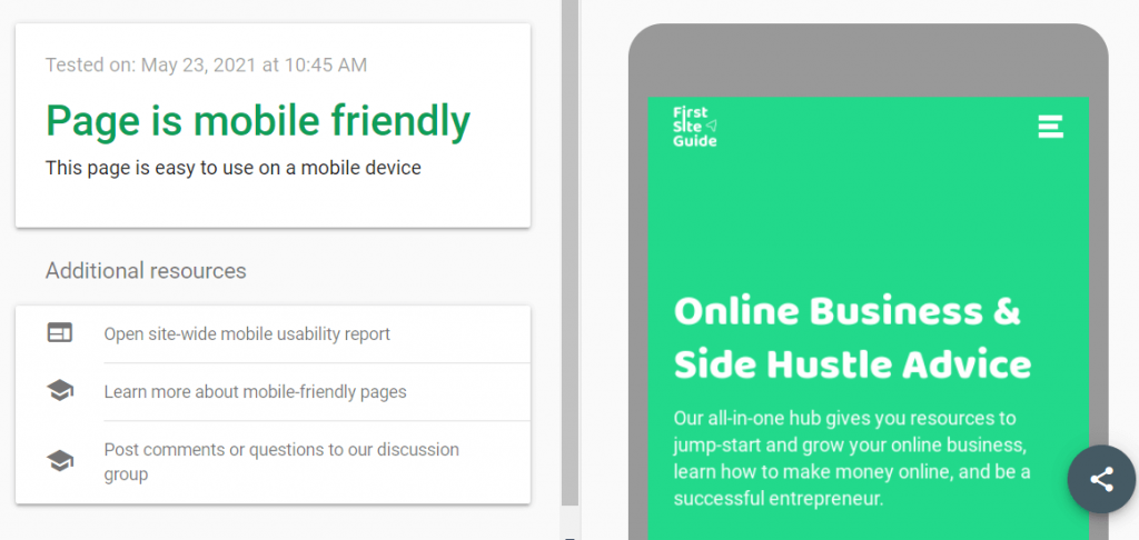
If you are interested in learning more technical details about your mobile site, there's another great test that you can perform online.
GTmetrix will allow you to enter the URL of your website (just like the previously mentioned tool), but instead of simply letting you know if the website is mobile-friendly, it will also show you reports about the performance and structure of your site, and give you grades based on those factors.
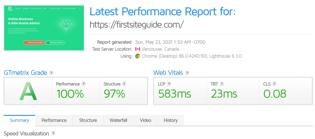
If you examine the details, you will be able to identify the weak points of your site. This can be the starting point of your optimization process.
How to optimize your site for mobile
Now that you have tested your site, chances are that it is not 100% optimized for mobile. There are always a few elements that can be improved.
Focus on simple designs
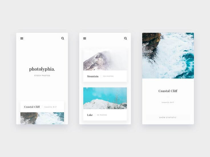
If you haven't decided on a template for your website, keep simplicity in mind. Mobile devices have smaller screens, which means that fewer elements can be displayed on them. Not every image that you show on desktop needs to be visible on mobile screens, and not every menu item or icon has to be included.
A mobile website needs to be simple, and help visitors get the information they need.
Use responsive themes
If you're using WordPress, make sure that your theme is responsive. This means that the theme has been designed to scale, depending on the device used to access it. This will save time and stress when it comes to optimizing the entire website for mobile.

Again, if you are using WordPress, there are some popular responsive themes worth checking out:
- Divi
- Ultra
- OceanWP
- Astra
Use mobile menus
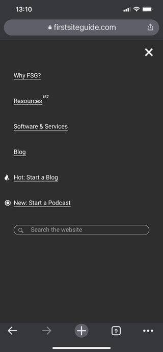
Standard website menus are not well suited for mobile devices. You do not want to show the standard menu that will clutter your mobile website. Instead, a mobile menu will hide all of the items into a widget that will only display once a user decides to show it by tapping on the menu icon.
WordPress users will find it easy to create mobile menus with free plugins like Responsive Menu that will let you generate one in a matter of minutes. This free plugin allows you to choose a template, change icons, colors, and assign WordPress menus with ease.
This tool is already coded with speed in mind, so you can relax knowing that it will work in your favor and that the site menu will be great, no matter where you open it.
Use standard fonts
Not many beginners know that fonts are "heavy". Loading non-standard fonts on your site will increase waiting time for mobile users and make it less user-friendly. I know you wanted that particular paragraph painted in a special color and written in a hand-written font that you saw on a friend's site. But a standard font may look just as good, and keep in mind that it will make your site load faster. Do you really want to sacrifice losing visitors just because of the font style?
If you want to make sure that the standard fonts can still look good, just take a look at the Standard Font List.
Use media queries
Media queries are a special CSS technique used when designing mobile-friendly websites. They allow you to change the look of your website on specific screen sizes. By utilizing this technique, you can show or hide specific elements on specific screen sizes.
For example, if you're using a huge hero image (the main image of your website that's the first focal point of your desktop site), it would be a smart move to hide that image for mobile users so that you do not put a heavy load on the mobile site. Media queries will allow you to do that.
Or, in another example, you will have to make your headline smaller to fit mobile screens better. In this case, you would use this query:
@media only screen and (max-width: 600px) {
h2 {
font-size: 20px;
}
}
This is just a simple example, and explaining the details is beyond the scope of this article. If you're interested in learning more about media queries, W3 Schools is a good starting point.
Optimize image files
One of the biggest positive changes that you can do to your site is to optimize images. A single non optimized image can render your mobile website unusable. Imagine the differences of loading 2MB instead of 40KB of data. Yes, we are talking about seconds, even tens of seconds if loading from a slower network.
There are a few things to focus on with image files:
- Resize images – do not upload images bigger than you need them to be.
- Hide big images – hide large images from mobile sites via media queries or load smaller versions of it.
- Compress images – lower quality won't be obvious, but you will improve the speed of your website.
- Lazy load images – show images only when a user scrolls to it. You can use Smush, a free plugin for this.
To optimize images, you can use free online tools like Kraken that will let you upload your images and choose the quality of the output.

After you "release the Kraken" and let it do its magic, you will have a much smaller image that you can safely place on your site.
If you already have a lot of images on your site, changing each and every one of them can be a daunting job. Luckily, if you're using WordPress, you can use specialized plugins like ShortPixel that will compress and optimize images on your entire website.
Avoid large chunks of text
Not everything is speed-related. Having long paragraphs of text will make your mobile site unreadable. Make sure that you break up large chunks of text with a separator or simply add white space between every few sentences.
You can also use images to make the text more interactive, but make sure that you are using optimized images in this case.

Make forms simpler
Having longer forms on websites is not unusual. Desktop users probably won't shy away from entering a couple of more fields if needed, but mobile users are different.
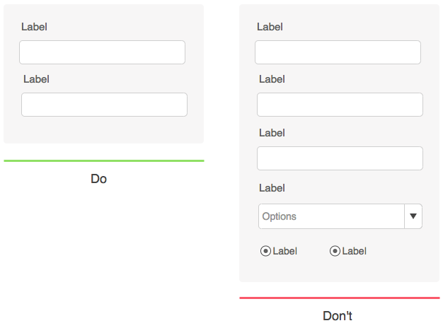
Long and complicated forms will look even more complicated when displayed on smaller screens, and people may feel overwhelmed by them. Also, mobile users have a shorter attention span, so you want to keep forms as short as possible, asking only the most essential information.
Make sure that call-to-action buttons are large and visible so that people don't have to use a stylus to press them.
Eliminate popups
No matter what you have to offer, don't show popups on your mobile site. People do not like popups in general, but having one on mobile sites just adds additional load on your site. They also frustrate people browsing from their phones.
If you have to show a special offer or ask people for their email address, you can do that by showing a simple banner or widget within your mobile site instead.
Include a search function
No matter how well-structured your site is or how great the menu looks on mobile devices, the fact is that navigation is a bit more complex than on desktop devices.
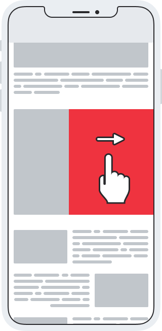
Instead of letting people wander around your site searching for a specific page, help them find what they want by implementing a search function. You can place a search form at the top or bottom of your page, depending on how important this is to you.
An even better option would be to have a search function embedded into your mobile menu so that it is always available for your visitors.
Make your contact form easily accessible and enable people to call you by showing a button
If you are running a business, you want people to be able to contact you. If they're coming to you from a smartphone, you want to make sure that they can easily find your contact information.
The first thing you should do is to have a link to your contact form or have your email address clearly visible on the menu. If you want people to contact you over the phone, you should print your phone number right there as well. This will allow people to call you just by clicking on the phone number.
If you want to improve this even further, there's an amazing free WordPress plugin that allows you to place a call button on mobile pages. WP Call Button will help you to design a button that will be always visible to users coming from smartphones and will allow them to easily call you.
Take care of Core Web Vitals
Recently, Google introduced a set of factors that are important for user experience. There are three factors to consider when running a website:
- Loading performance (Largest Contentful Paint) – how long does it take for the largest element on your site to load (for example, the largest image you have on the homepage).
- Responsiveness (First Input Delay) – how long does your site take to react to the first user interaction (like a touch on the screen when opening the site on a smartphone).
- Visual Stability (Cumulative Layout Shift) – do elements on your site move while loading? The more stable the site is, the better.
To get started with Core Web Vitals:
- Go to Google Search Console and log in to your Google Account.
- From the left-hand side of the screen, find the Performance tab.
- Click on "Core Web Vitals".
After taking all three metrics into consideration, Google will let you know how well your site performs. Obviously, you want every segment to be as perfect as possible. If improvement is needed, you need to respond.
For example, Google may show you that your mobile site loads too slowly. You will then have to test your website with the different tools I shared above, and find the problematic element. Let's say that one of the images was the problem – you will have to optimize it, and upload it to the site again.
Once you think you've resolved the issues, you should go back to the Google Search Console where you will be able to revalidate the site by clicking the "Validate" button. Although in some cases it may work faster, do note that Google usually needs at least 28 days to make sure that everything works fine.
Mobile usability
Just below Core Web Vitals in the Google Search Console, you will find the Mobile Usability option. This simple tool monitors your mobile site constantly, so it will quickly display any errors that it finds.
If there are any issues, Google will list the problematic page here and show more details about the problem.
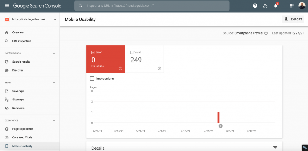
The most common problems (and the most important ones to fix) will be listed at the top, so start working from the top to the bottom. Take your time, and check all of the errors listed. Every issue will come with an explanation from Google so that you can learn more about it and more importantly, learn how to fix it.
You can learn more about Mobile Usability on Google Support.
Optimize JavaScript and CSS
Along with large and unoptimized images, CSS and JavaScript are some of the most common problems that affect the speed of a mobile site. While code will enable some fancy features on your desktop site, if that particular feature is not crucial, I strongly suggest not loading the code for mobile users.
If you are a beginner, you may be stuck already, but don't worry. You really do not need to know how to code or even how to recognize JavaScript and CSS in order to remove unnecessary files.
- Install Asset CleanUp, a free plugin for WordPress.
- Turn on the test mode.
- Review JavaScript and CSS that are currently loading on your site.
- Disable the code that you think you do not need.
Since you're in a test mode, you can feel free and experiment. If you turn off a specific file, and something doesn't work on the site anymore, just turn it back on. On the other hand, if there are no changes to the site's appearance, you can keep the feature disabled and be proud of yourself because you just sped up your mobile site!
Although there is a test mode, be careful when using this plugin. Before any changes are made (and even before installing the plugin), make sure that you have a fresh backup of your site. You never know what might happen, and it's good to be prepared.
Another way to improve JavaScript and CSS is to minify the code. What does that mean? Instead of having large files that store all of the code necessary for your website to run smoothly, minification is a process that combines all of the code and crunches it into the smallest file possible. While smaller sites may not see a huge effect from minification, larger sites can improve their speed dramatically.
Don't worry! Again, you are not required to understand how code works to minify it. There are free plugins that will solve your problem quickly, so I suggest checking the Fast Velocity Minify plugin.
Keep testing
You're still not done. Having a good mobile website means constant testing. Keep opening your website on your mobile phone or tablet, and don't forget to ask people around you what they think.
If you have a lot of traffic, you can even take this to the next step by surveying people about their mobile site experience.
FAQs
What is the difference between a website and a mobile website?
Classic websites are usually accessed via desktop and laptop computers. These websites are usually larger because they are accessed from bigger screens where users interact with them via keyboard and mouse. Mobile websites are duplicates of the original website with fewer elements, or they are responsive equivalents that simply adapt well to smartphones and tablets.
How can I test to see if my site is mobile-ready?
The first thing you can do is to open your website on a mobile phone or tablet. It should look different from the desktop version, but still have most of the elements available to you. After this, you should take a Google mobile-friendly test as well as a GTmetrix test that will give you more technical details about your website.
Is an app better than a mobile website?
Mobile applications are more sophisticated versions of a mobile website. This usually means faster loading, more settings, and a better user experience. However, creating apps takes more time and money, and usually makes sense only for websites with a high number of visitors that can benefit from it.
Conclusion
If you are starting a website in 2021, you simply cannot forget about mobile users. In recent years, many web designers and developers have even started prioritizing mobile users. The future lies in the hands of mobile users, so make sure that you follow the trend, and always have an optimized and mobile friendly website, no matter which platform you're on.
How To Create A Mobile Optimized Website
Source: https://firstsiteguide.com/mobile-friendly/
Posted by: boothereastill.blogspot.com

0 Response to "How To Create A Mobile Optimized Website"
Post a Comment