How To Create A Scatter Plot In Excel
Let's discuss how to make a scatter plot in Excel!
A scatter plot (also known as an XY chart) is a type of chart that shows whether there is a relationship between two variables. It's one of the many chart types available in Excel.
With this type of graph, one variable is plotted on the horizontal axis and the other on the vertical, and any resulting pattern is used to determine what kind of correlation, if any, exists between them.
Scatter plots are interpreted as follows:
- If the dots or points on the scatter chart seem to form a line, then the relationship between the variables is said to be strong.
- If the line formed slopes from the lower left to upper right, then the correlation between the two variables is said to be positive.
- If the line formed slopes from the upper left to lower right, then the correlation between the two variables is said to be negative.
- If the points are widely spread, then the relationship between the variables is said to be weak.
- If the points on the plot appear randomly, the two variables are interpreted as having no correlation.
Some scatter plots even have a trendline to make any pattern more evident.
When a scatter plot is generated with connecting lines, one may make the mistake of thinking that it is a line graph. However, scatter plots and line graphs are not the same. A few key differences are described below.
Download your free scatter plot practice file!
Use this free Excel scatter plot file to practice along with the tutorial.
Differences between a scatter plot and a line chart
You can tell the difference between these two chart types in the following ways:
- A scatter plot is more about the relationship between the two variables, while a line chart places more emphasis on the values attached to those variables.
- A scatter plot always has numerical data on both axes, with the objective of determining a relationship between the two variables. The chart plots the intersection of X and Y numerical values into single data points (see below). A line chart only has one numerical axis (the vertical, or Y, axis).
- A scatter chart never displays categories on the horizontal axis, while a line chart does.
Let us suppose that we had the following worksheet data:
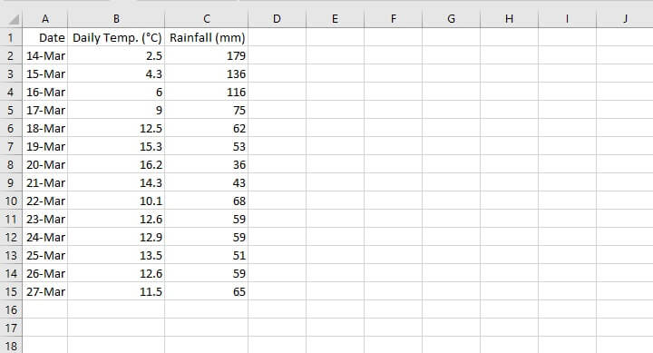 The following shows the result of creating a line chart when a scatter graph should have been plotted instead.
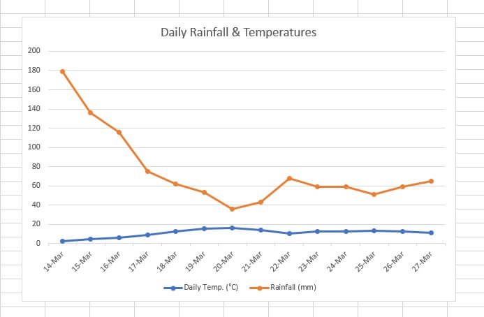 Two limitations of the above line chart are:
- Since the numbers being used to measure each variable are so far apart, it is difficult to see the changes and fluctuations to the numbers which carry a smaller value (Daily Temp). We cannot clearly see the disparity between the temperature on March 14 (2.5 degrees Celsius) and the one on March 20 (16.2 degrees Celsius).
- If you're trying to establish correlation between the two variables, it is difficult to determine a pattern. This defeats the purpose of a chart, which is to simplify complex data.
A scatter plot of the same data, on the other hand, would look like this:
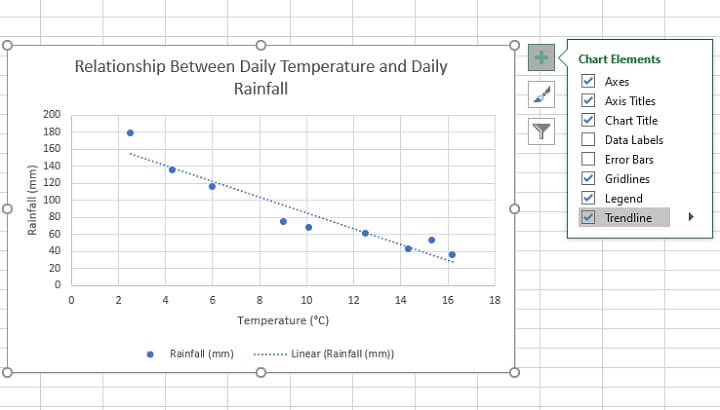
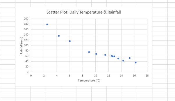 A clear inverse relationship is shown between both variables on the above scatter plot. In this case, the date column (column A) was omitted from the chart source data as it was irrelevant to the relationship between the two variables.
When to use a scatter plot
The decision to use a scatter plot, or any kind of chart for that matter, will usually be based on what kind of story your chart is supposed to tell.
If your chart is supposed to demonstrate a relationship between two numeric variables, a scatter plot is probably a good choice.
Examples of this may be: a scatter plot showing the correlation between people's salaries and the size of their homes, or between the amount spent on advertising and the amount of revenue generated. In both cases, you would be wanting to determine whether a cause-and-effect relationship may be inferred from the graph.
A scatter plot would answer questions like, "Does there appear to be a relationship between daily temperature and daily rainfall? Can we expect that a change in one will likely result in a predictable change in the other?"
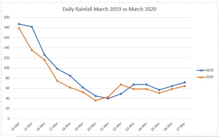
On the other hand, use a line graph instead of a scatter plot if your data has text values being measured over a period of time, or if you are comparing multi-series categories, like rainfall for the same dates across two or more years.
On a line graph, the Y-axis will usually carry numeric values, and the data points will be linked to form a timeline, as depicted below.
How to make a scatter plot in Excel
Let's walk through the steps to make a scatter plot.
Step 1: Organize your data
Ensure that your data is in the correct format. Since scatter graphs are meant to show how two numeric values are related to each other, they should both be displayed in two separate columns.
The first column will usually be plotted on the X-axis and the second column on the Y-axis. The independent variable usually falls on the X-axis and the dependent variable on the Y-axis.
Step 2: Select the relevant data
Highlight the columns containing both sets of variables. If the columns are non-contiguous, hold down the Ctrl key between selections. Only select the columns with the two sets of data that are being examined for a cause/effect relationship.
Step 3: Select the desired type of scatter plot
From the Insert tab, go to the Charts group and click the Scatter graph symbol.

Types of scatter plots
Several types of scatter plots are available from the Insert Charts menu. These include:
- 'Classic' scatter chart (solely with data points)
- Scatter with smooth lines and markers
- Scatter with smooth lines
- Scatter with straight lines and markers
- Scatter with straight lines
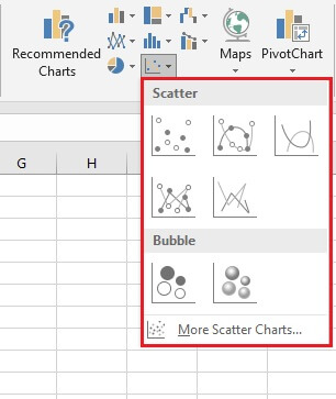 Scatter charts with lines are best used when you have few data points. Otherwise, the plot area can begin to look quite cluttered.
Multiple XY pairs
What if you want to make a scatter plot in Excel with two or more sets of data? Can you create a scatter chart with multiple XY pairs?
Indeed you can, and in fact, this can be done in more ways than one. Below is perhaps the simplest and most straightforward method:
- Create two separate data sets. Organize them as previously shown, whereby for each data set the dependent variable should be to the right of the independent variable, as seen below.
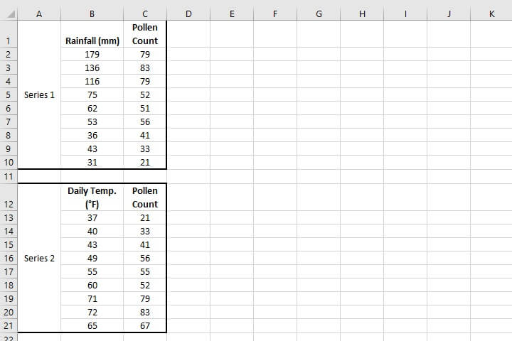
- Create a scatter plot from the first data set by highlighting the data and using the Insert > Chart > Scatter sequence.
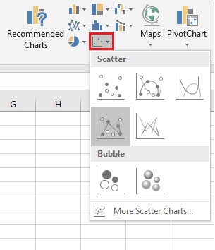 In the above image, the Scatter with straight lines and markers was selected, but of course, any one will do. The scatter plot for your first series will be placed on the worksheet.
- Select the chart.
- Go to the Design tab and click Select Data.
- In the Select Data Source dialog box, below Legend Entries (Series), click Add.
- Another dialog box, Edit Series, will appear. From here, you will enter the details pertaining to the second data set, including the series name, range of X-axis values, and range of Y-axis values.
- Click OK, and this will take you back to the Select Data Source dialog box.
- Click OK, and you will see the second set of XY values plotted on the scatter diagram.
Customize a scatter plot
Steps to customize a scatter plot are similar to doing so for most other charts. You can customize your graph by changing, adding, or removing things like:
- Data labels
- A chart title
- Axis titles
- A trendline
Do this by selecting the graph, then clicking on the green plus (+) symbol at the upper right corner for the Chart Elements shortcut. All the elements available for your chart type will be shown, with an expanding arrow to the right of each one, offering additional options.
For example, a Trendline is particularly useful in identifying patterns and can be added by simply checking the Trendline checkbox from the Chart Elements shortcut.
 Scatter graphs may be one of the most useful Excel charts you're not yet using. Important points to remember are:
- If dates or a timeline are important, then you may need to think about a line graph or maybe even a column chart.
- If you think that two variables have a correlation and you want to highlight or determine that relationship, a scatter diagram is your best bet.
- Independent variables are usually shown on the horizontal axis and dependent variables on the vertical axis.
- A trendline can help you to establish the type of relationship if it isn't immediately apparent.
Learn more
Like what you learned? Learn even more about Excel charts from our Basic and Advanced Excel course! Or start with some charting basics by trying our free Excel in an Hour Crash course.
Free Excel crash course
Learn Excel essentials fast with this FREE course. Get your certificate today!
Start free course
How To Create A Scatter Plot In Excel
Source: https://www.goskills.com/Excel/Resources/How-to-make-a-scatter-plot-in-Excel
Posted by: boothereastill.blogspot.com

0 Response to "How To Create A Scatter Plot In Excel"
Post a Comment